

Jaime Pears has curated a soothing blend of white, gray and beige elements in her Chelsea home.
The number of decisions required in building a house can be overwhelming, and then you have to consider furnishings for each room. But for Jaime Pears, the building and decorating process was enjoyable—and it came naturally to her. Her mother passed away two years ago, but her eye for interior design lives on in Jaime, a speech pathologist for Shelby County Schools by weekday and a home goods hunter by weekend.
“This was her thing – to decorate,” Jaime says of her mom. Pieces of her furniture grace the Chelsea Park home where Jaime and her husband, Matt, live with their dog. “I always like to put something of hers in every room.”

Jaime’s weekend routine includes Saturday shopping trips to her favorite home stores (see the Behind the Scenes list on page ??) to browse new items. Since they chose to build, Jaime and Matt were able to choose many of the open-concept home’s elements, including the painted brick on the front exterior and the exposed brick archway between the living and dining rooms.
“I had to have the brick wall,” Jaime says. “Matt says I’m way into neutrals. The brick wall contrasts with it.” And three years into living in the house, she finds herself giving similar praise to other parts of hers and Matt’s newlywed nest.
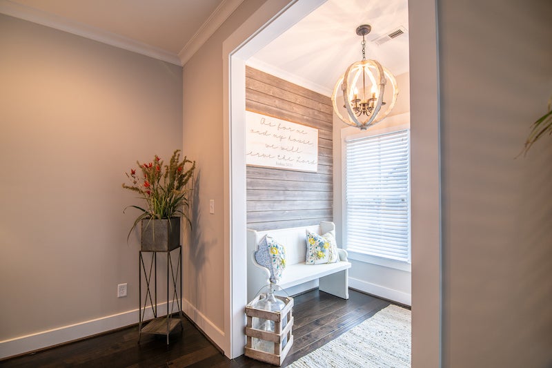
FOYER
As soon as you open the arched front door of the couple’s home, you see the weathered gray shiplap wall Matt completed—and that Jaime almost painted white. She’s glad she left it alone, though. The gray contrasts with the white bench from Magnolia Home. “We wanted it to feel cozy and have more character,” Jaime says.
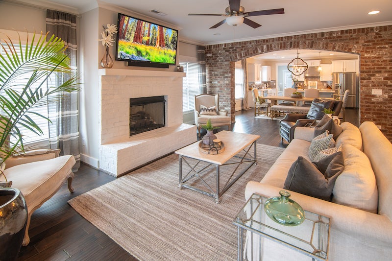
LIVING ROOM
The white painted brick on the front of the house gets a shout-out inside, on the fireplace. Jaime’s preference for white and neutrals is evident in the living room, where gray and beige play together across the curtains, sofa and throw pillows. She also used Sherwin-Williams’ Agreeable Gray paint color for the walls because it pairs well with everything and “it can look like two different colors,” she says.
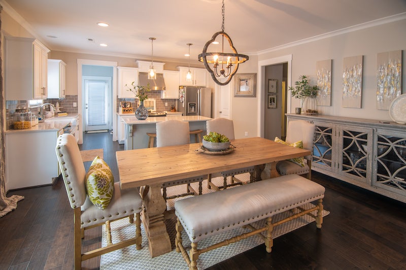
DINING ROOM
Neutral tones continue in the dining room. Artichokes in the centerpiece give the space a pop of green. The paintings hanging over the buffet were done by Birmingham native Chandler Kitchens.
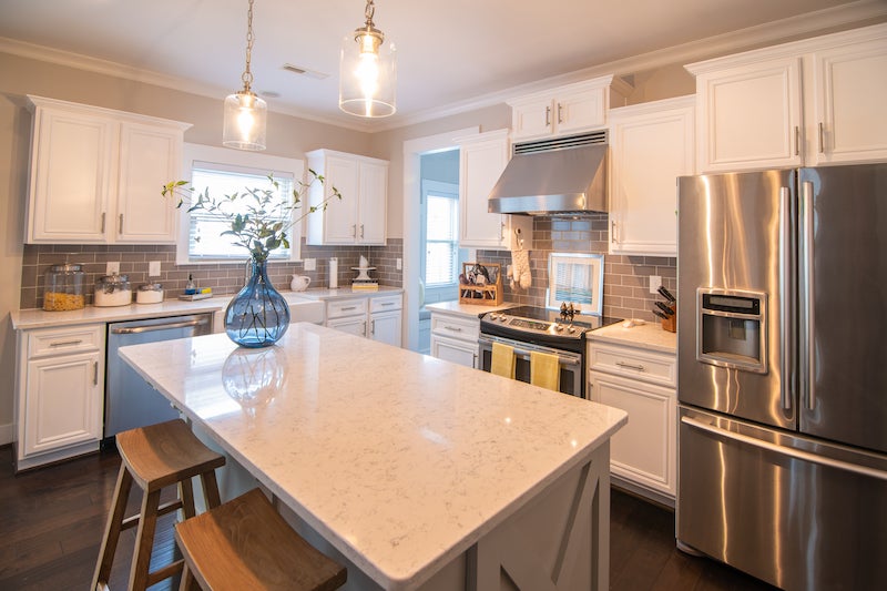
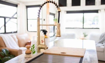
KITCHEN
Jaime and Matt chose quartz countertops because they can handle heat well and they’re easy to clean. All-white cabinets surround a bluish-gray island. Matt talked Jaime into the gray subway tiles, instead of white. Pendant lights and a farmhouse sink were among the upgrades they chose.
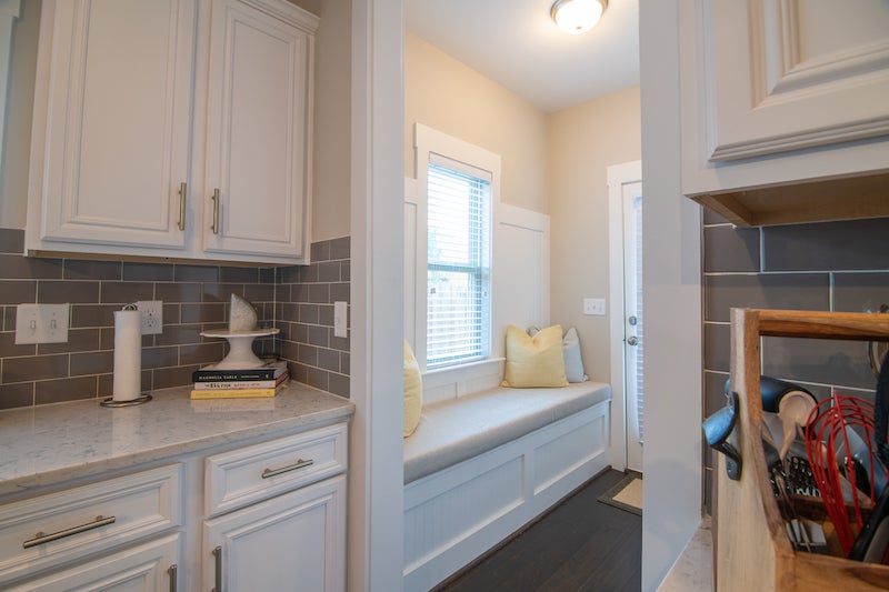
MUDROOM
This little nook, which Jaime also refers to as “mom’s room,” has a built-in bench. Family photos of Jaime’s mother hang on the opposite wall. Jaime says it’s her favorite spot in the house.
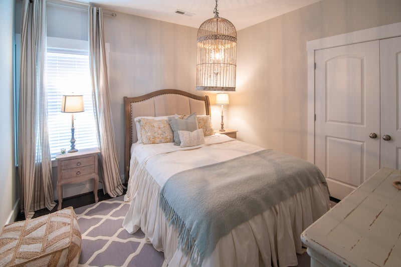
GUEST BEDROOM
Like she did for the living and dining rooms, Jaime used a soft color palette for the guest bedroom. Cream, gray and a pale robin’s egg blue color blend together under a whimsical, bird-cage-meets-chandelier light fixture.
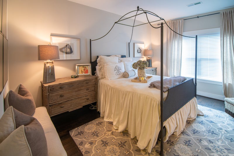
MASTER BEDROOM
Jaime selected an iron canopy bed from Restoration Hardware and neutral-colored linens from Three Sheets for the master bedroom, along with wall art and lamps from Urban Home Market. Jaime’s dad and Matt put up a barn door for the master bathroom.
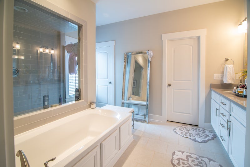
MASTER BATHROOM
Soft gray and white flow into the master bathroom, spacious enough to hold a walk-in shower and a soaking tub.
• • •
**BEHIND THE SCENES**
Interior Design: Jaime Pears
Furnishings: Home Goods, At Home, Urban Home Market and Restoration Hardware
Paint: Sherwin-Williams (Agreeable Gray)
Linens: Three Sheets in Homewood
Drapes: India’s Heritage
Artwork: Chandler Kitchens


